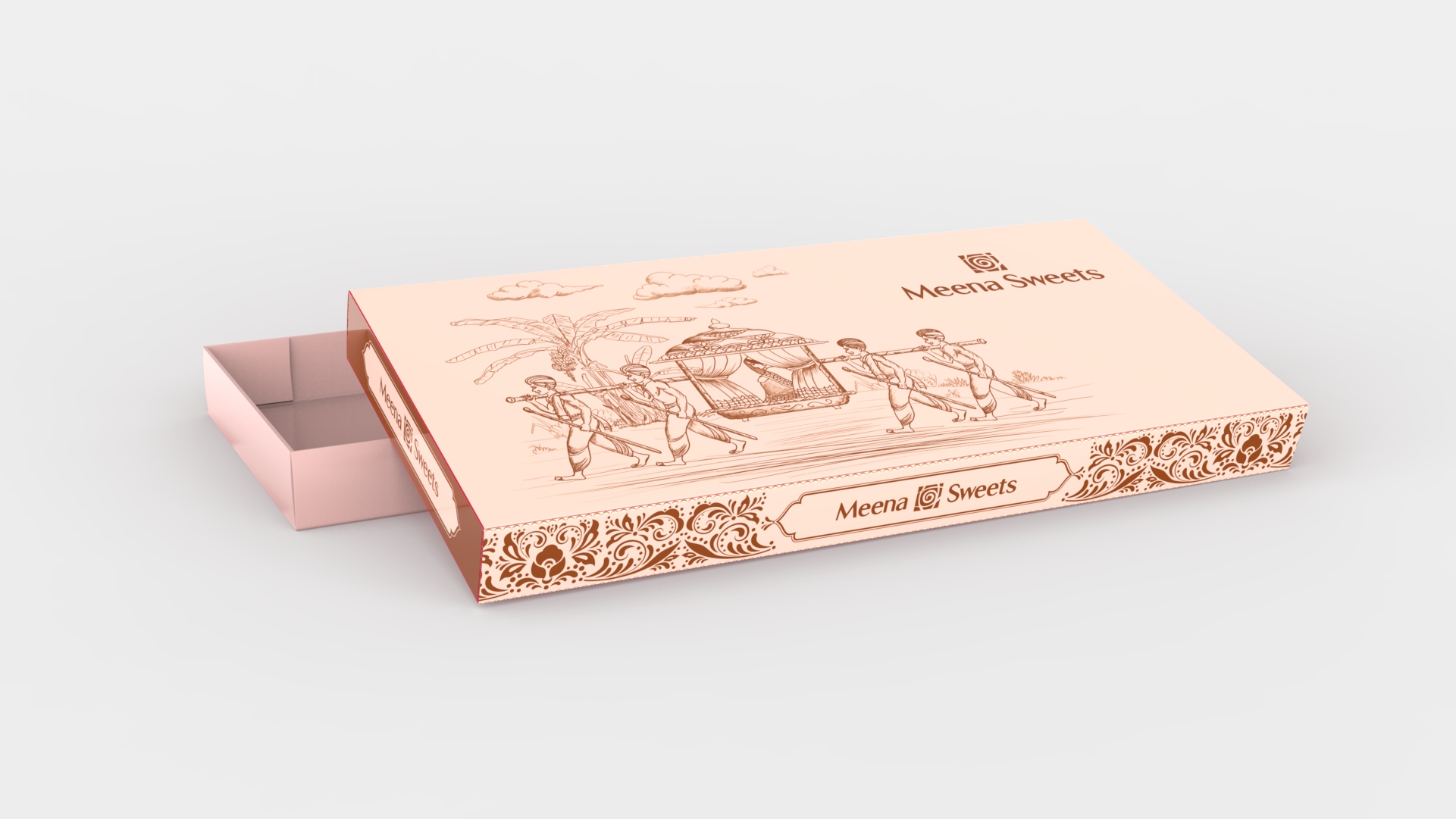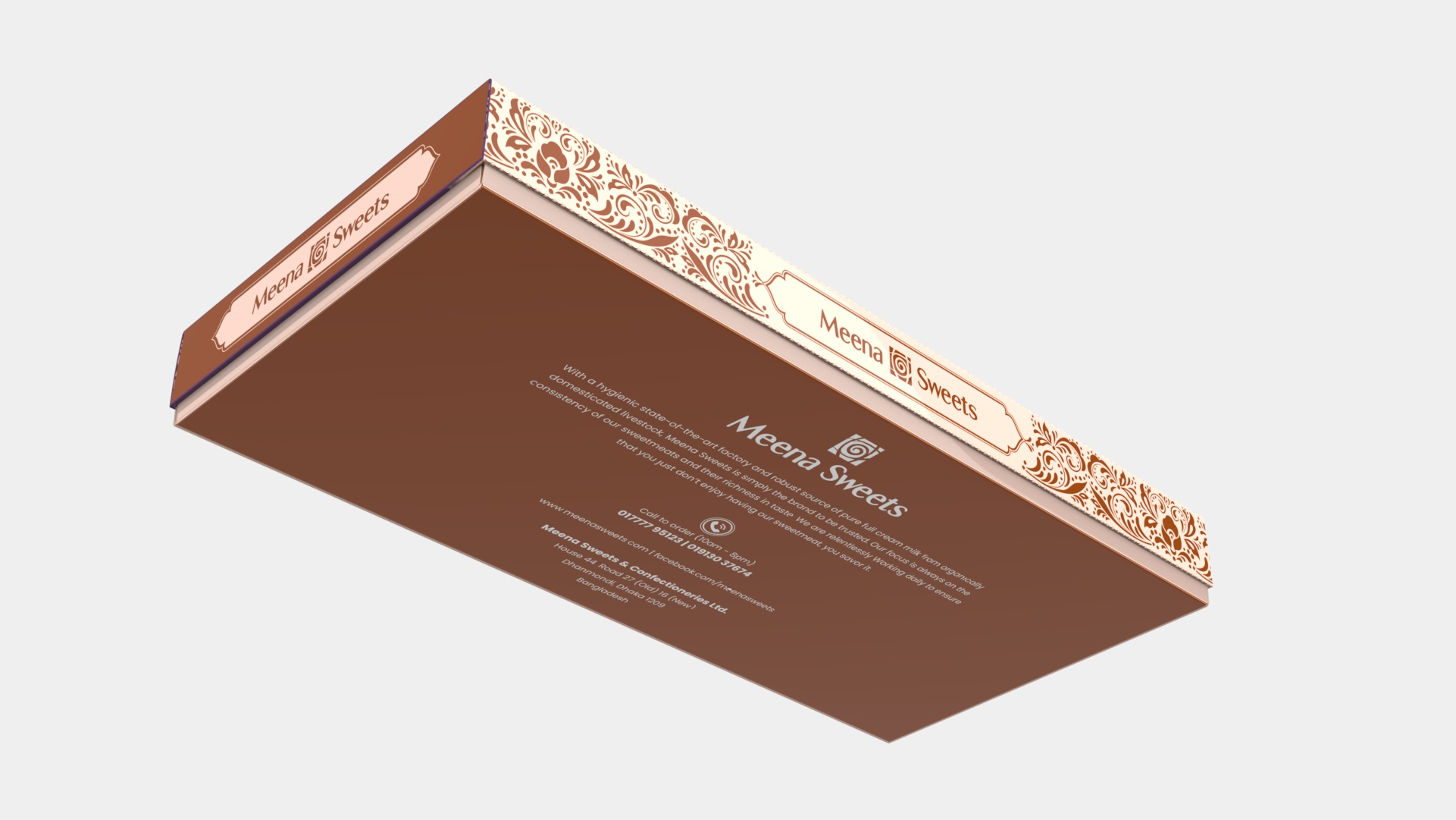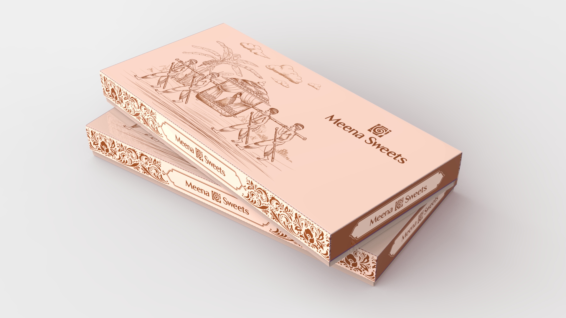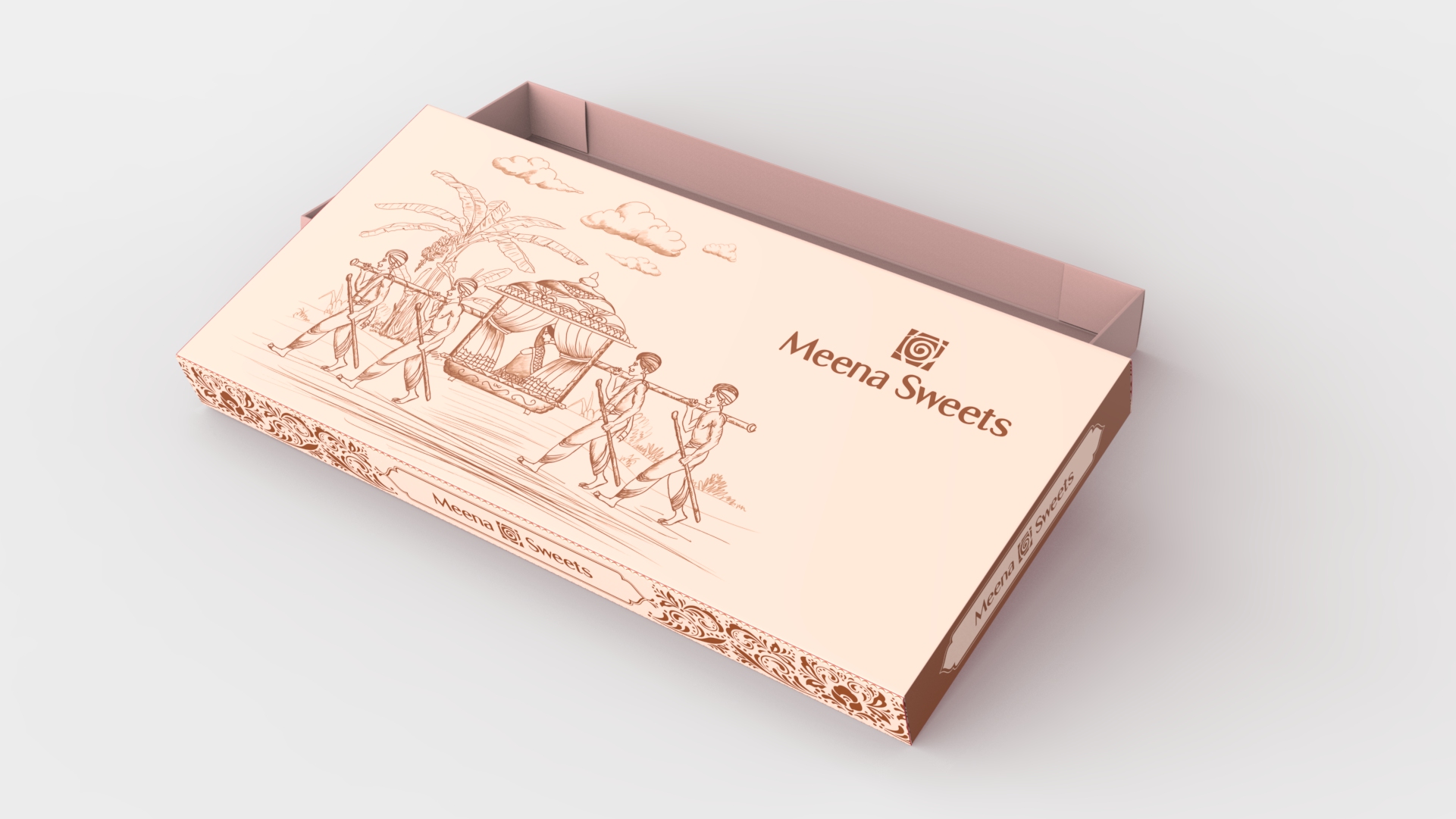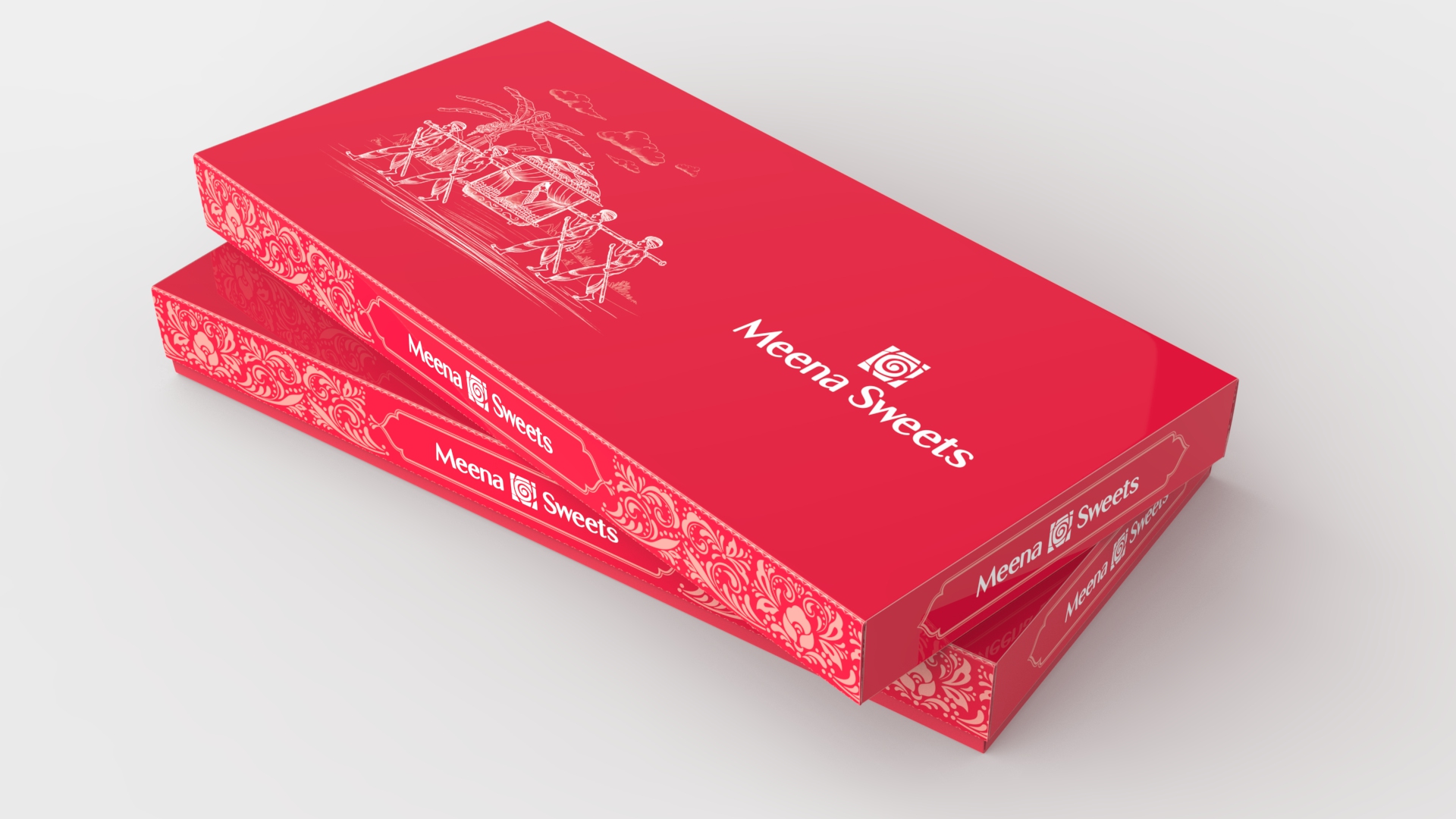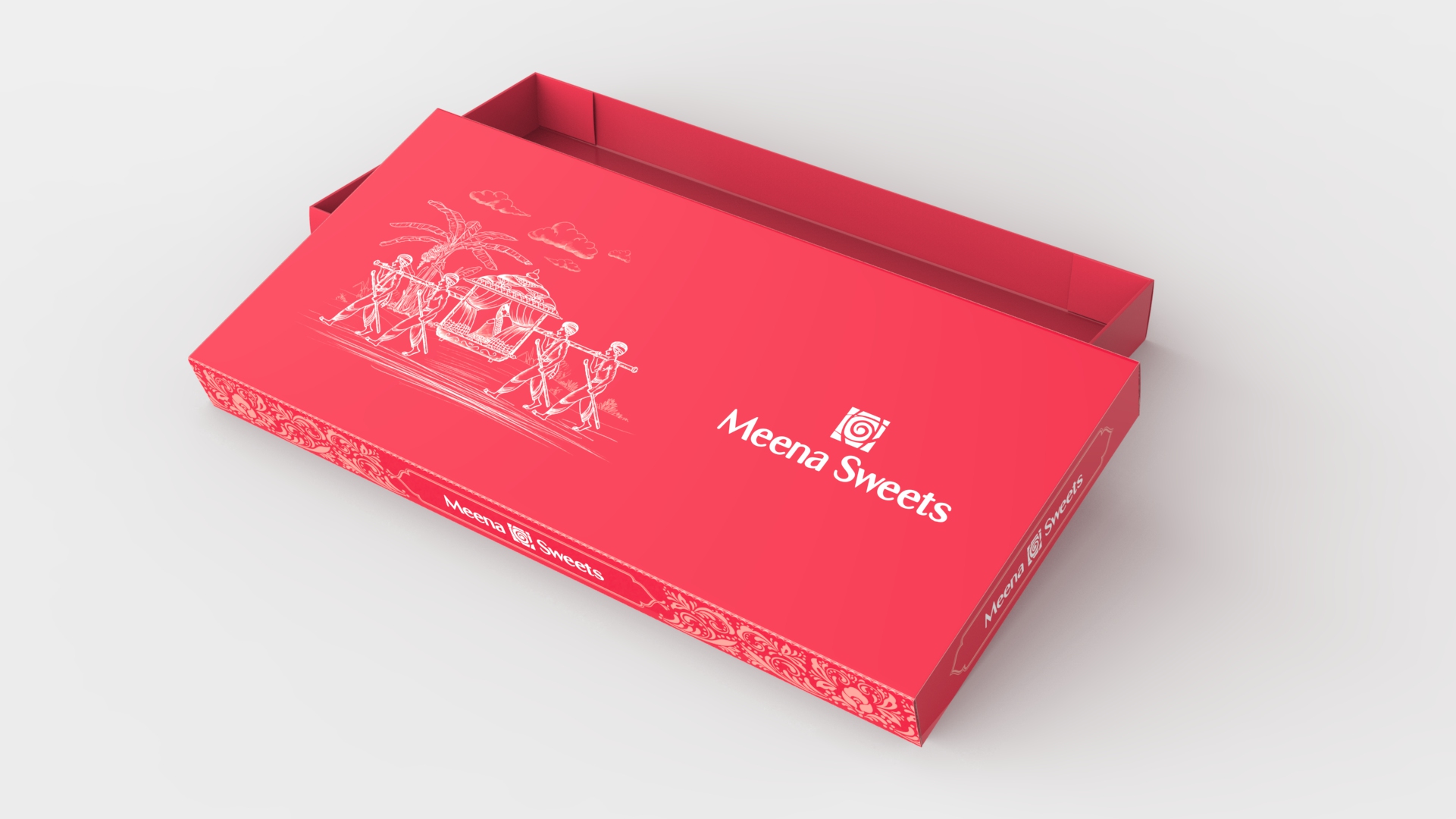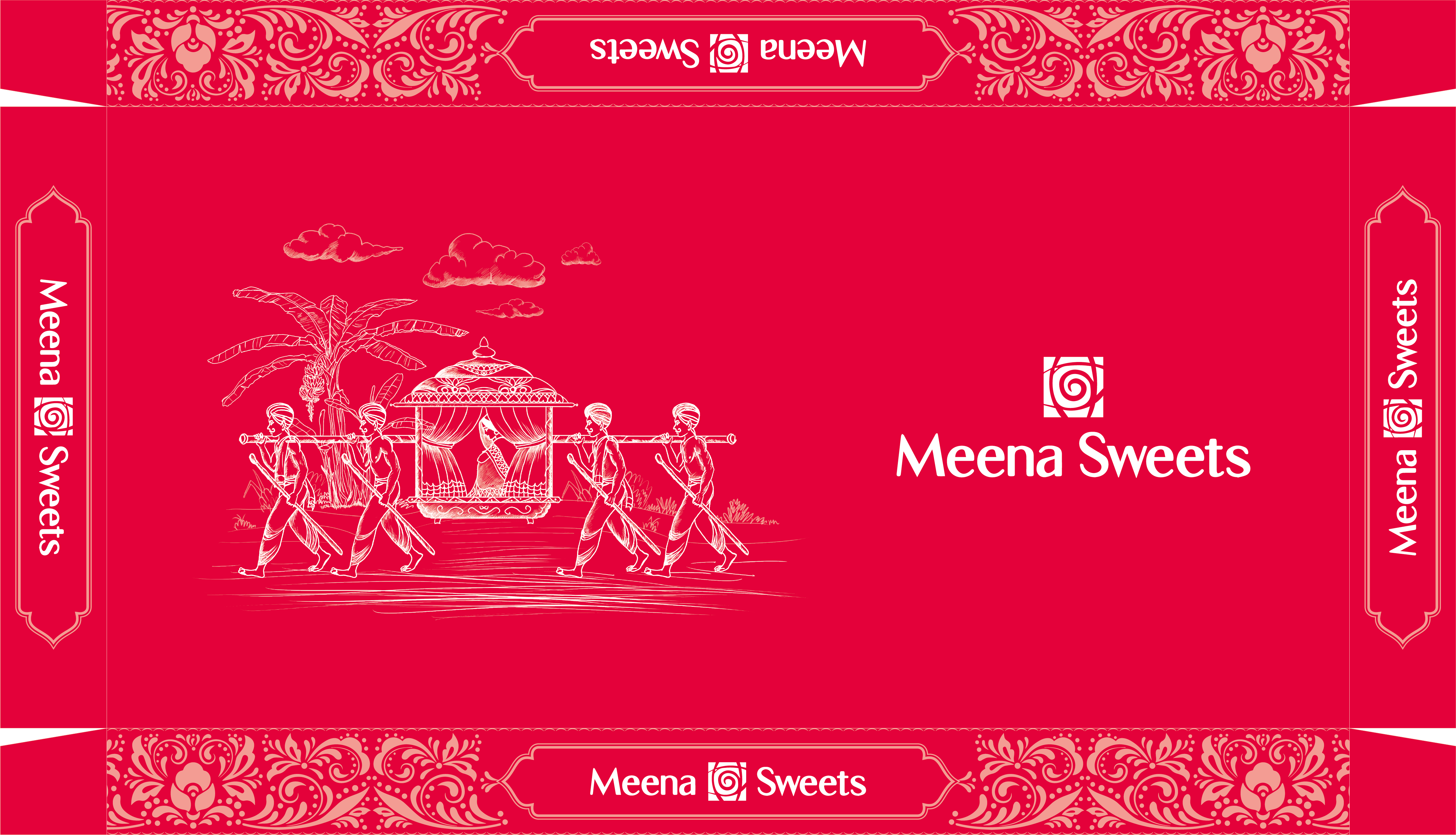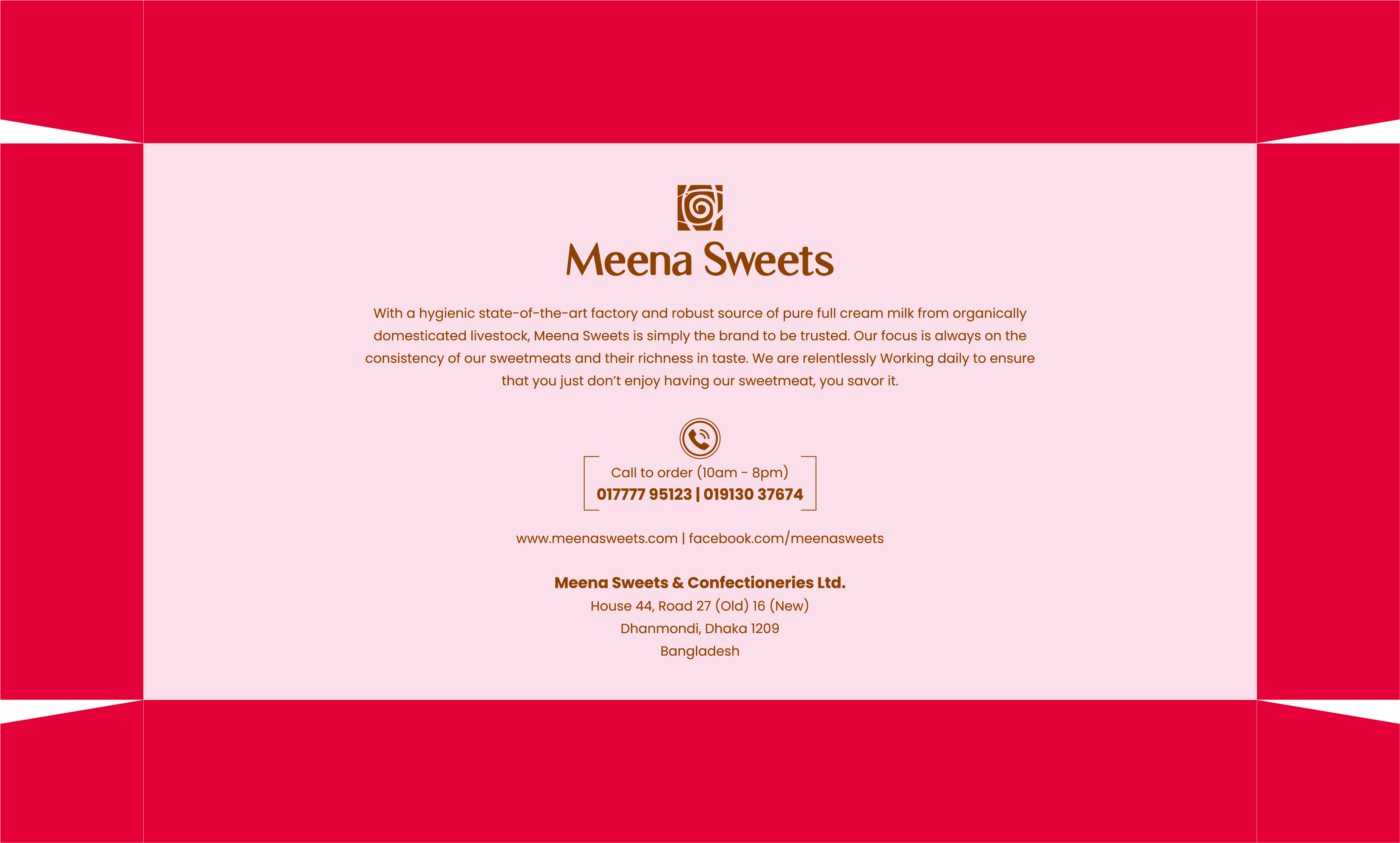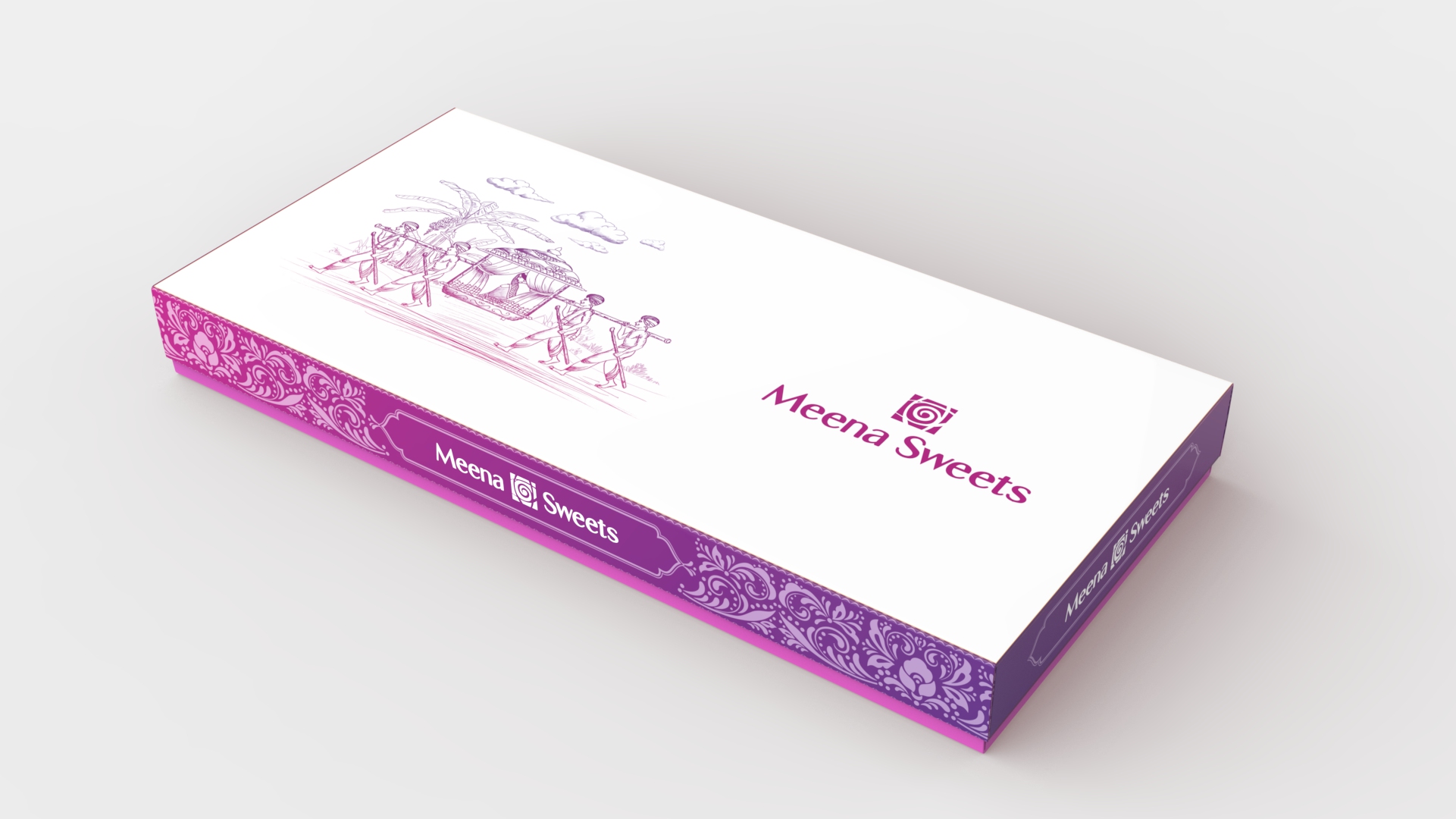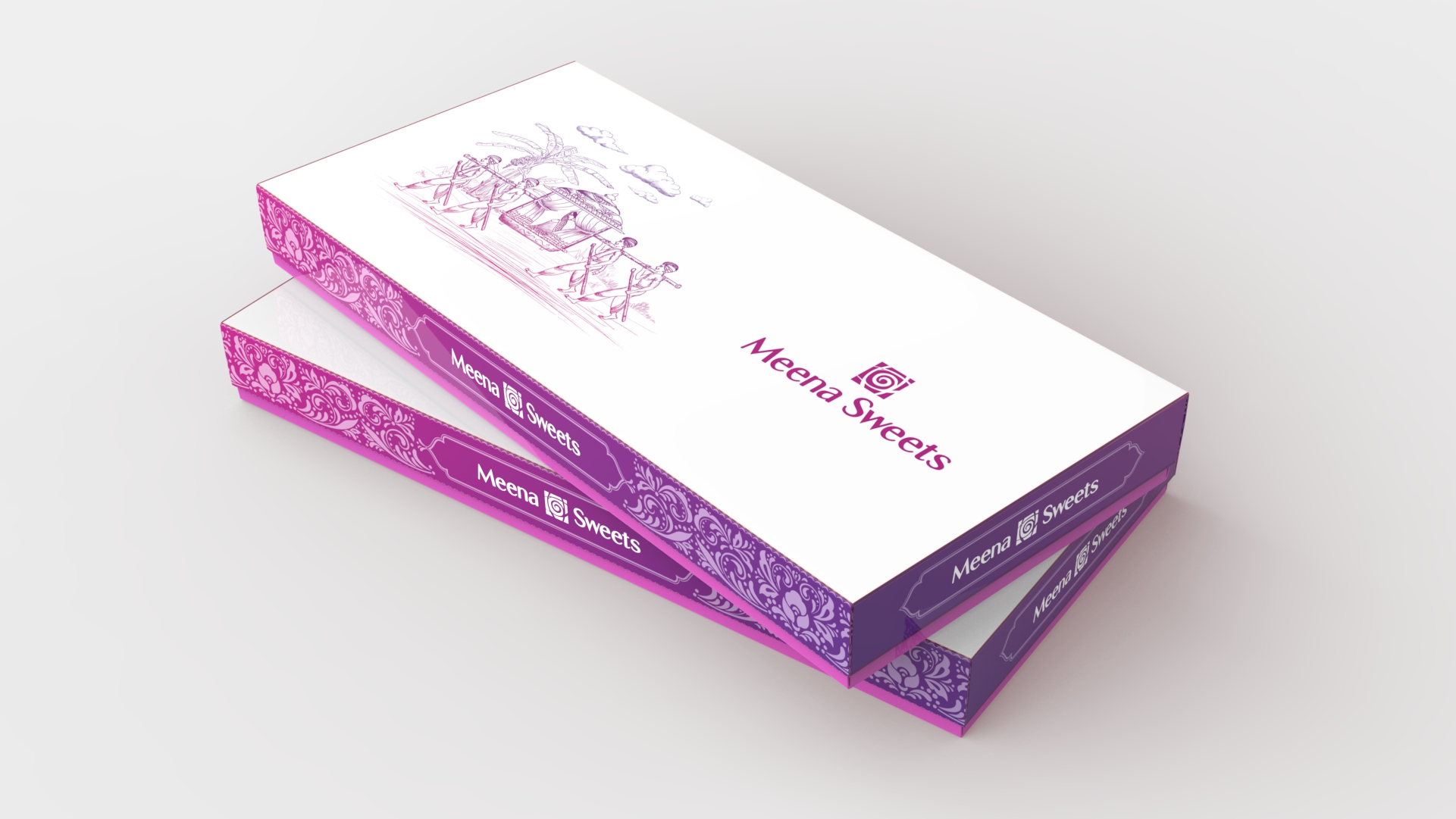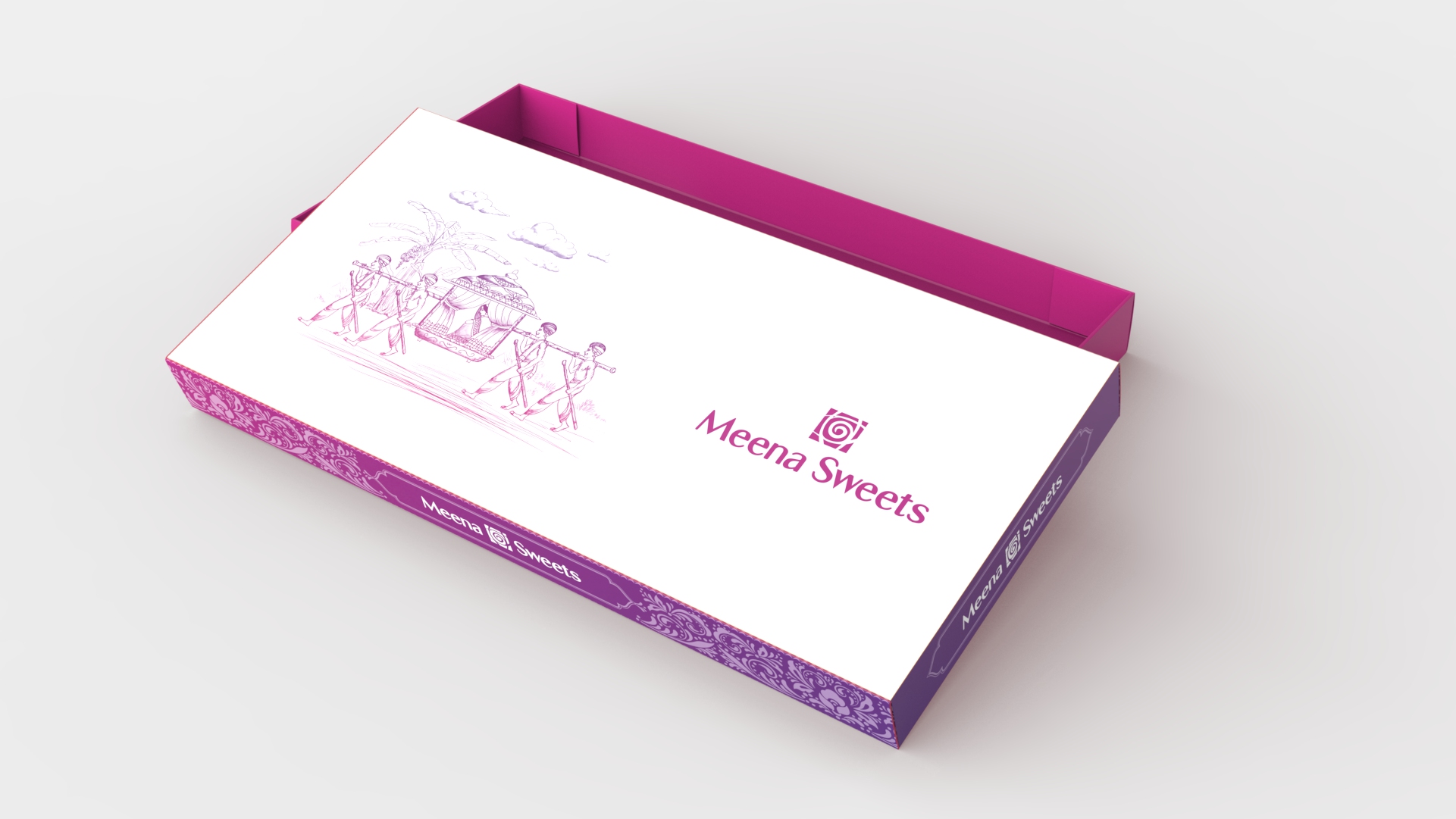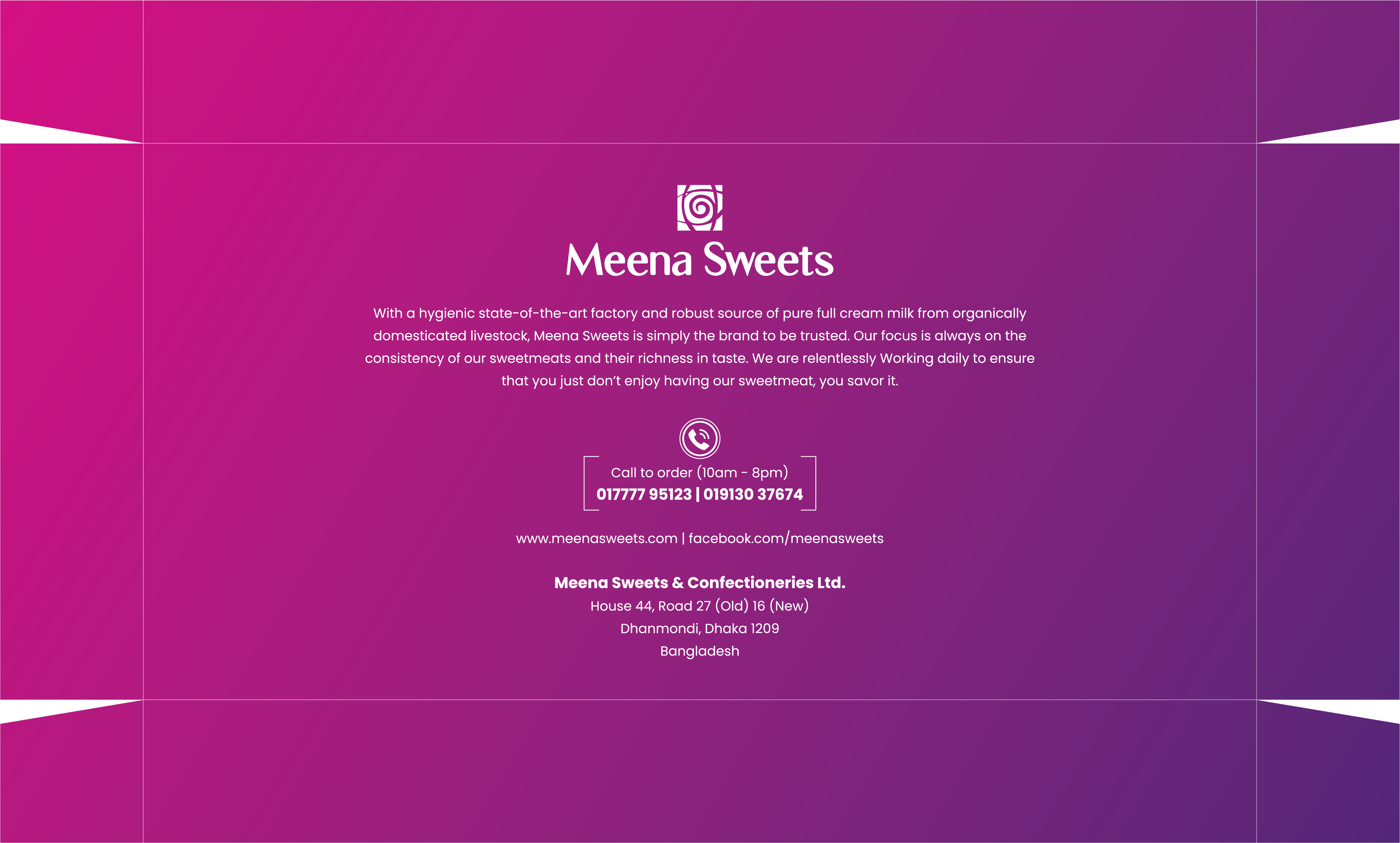
Variation 01
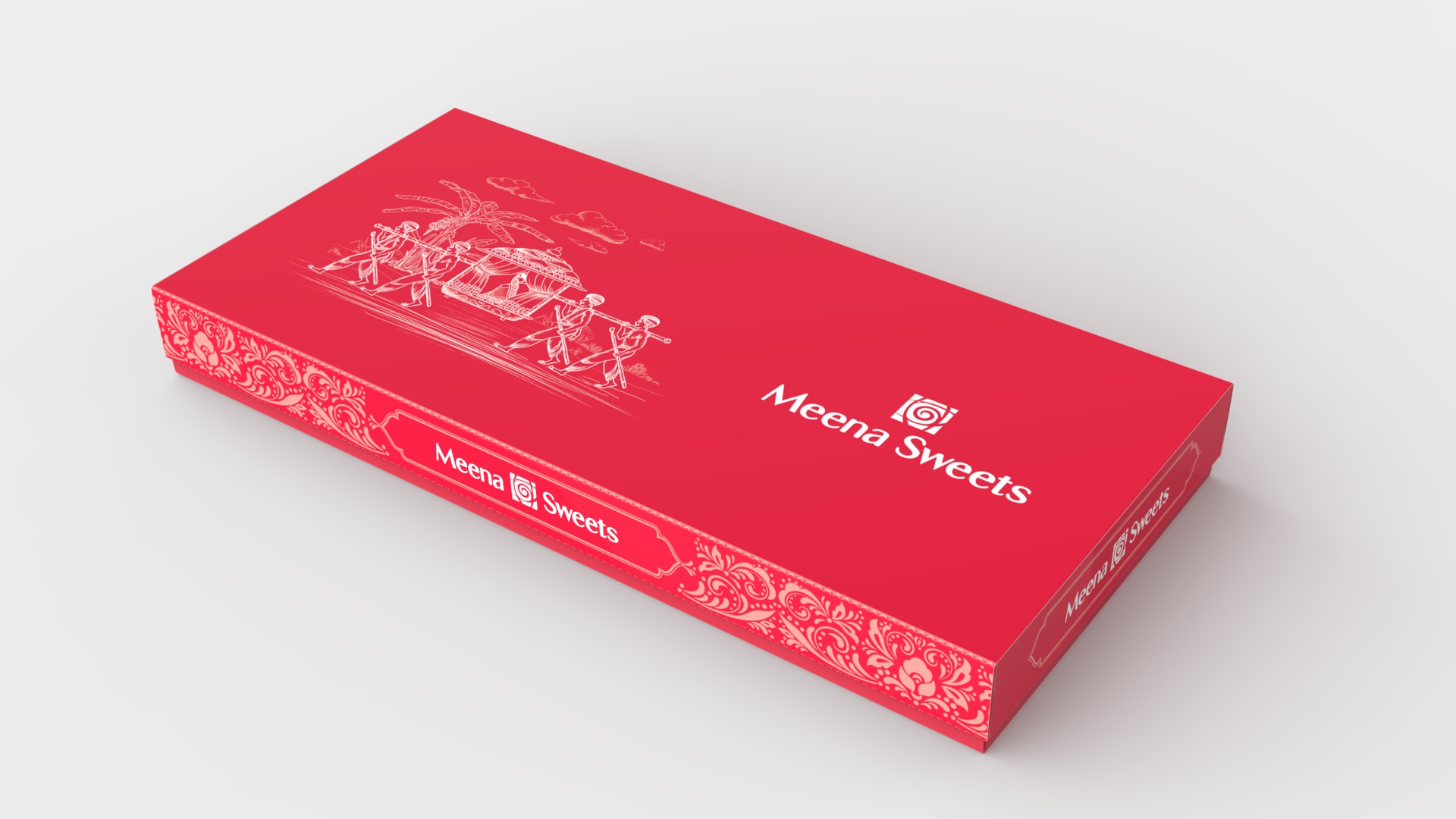
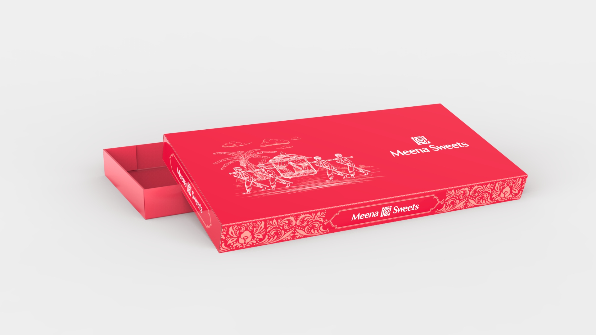
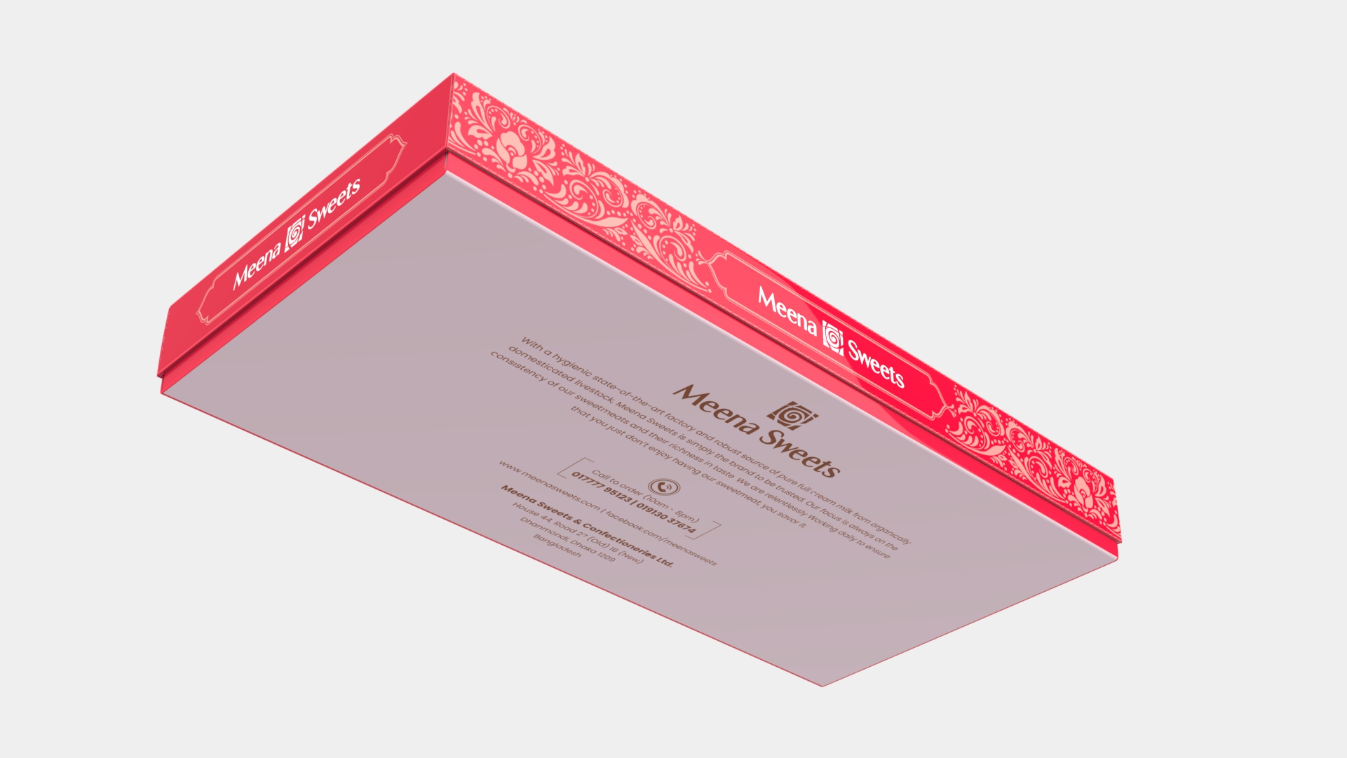
Mockup Presentation
(Followed by Brand Color)
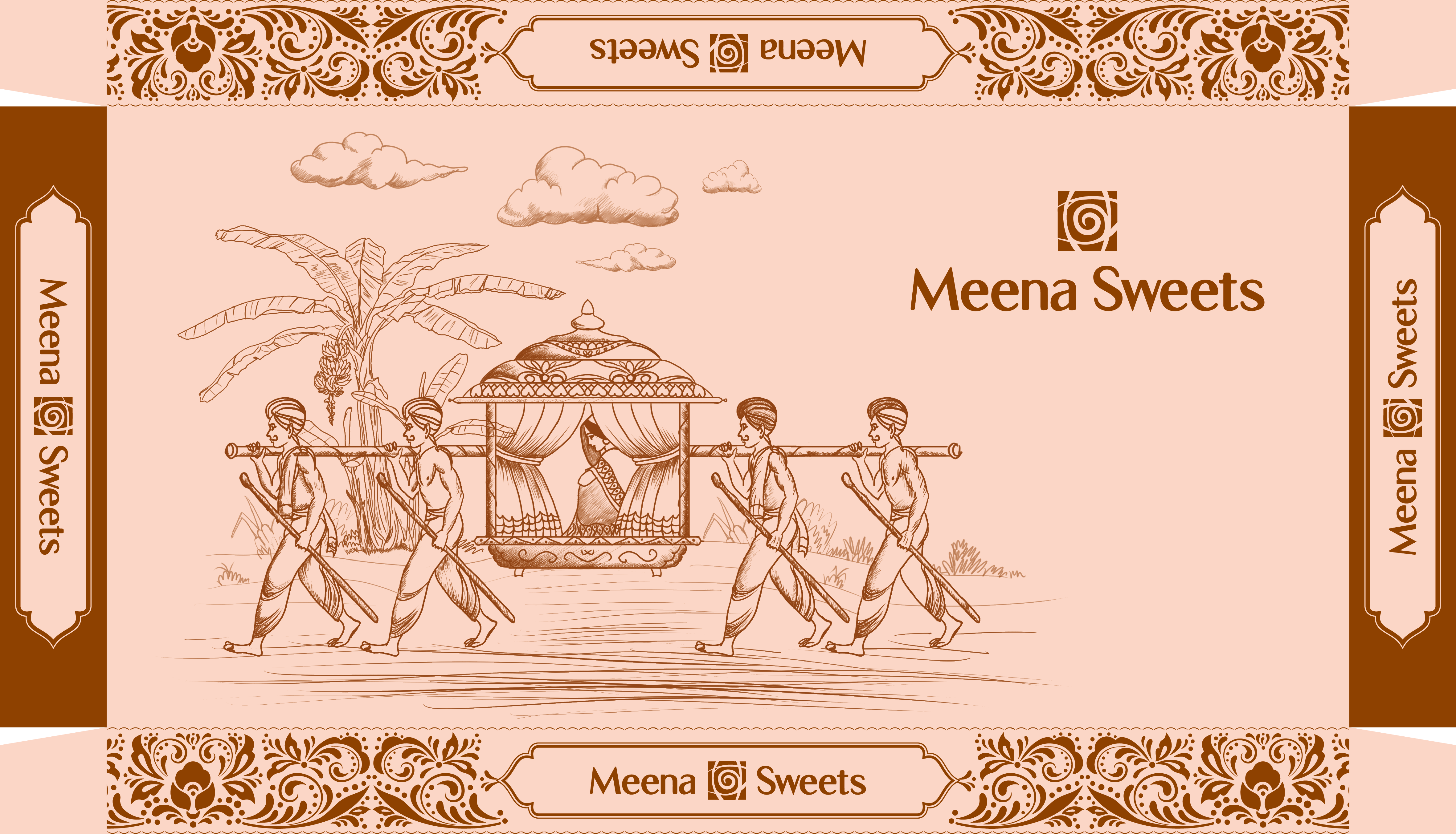
Variation 01 – Flat View
Variation 02
Mockup Presentation
Variation 02 – Flat View
Variation 03
Mockup Presentation
Variation 03 – Flat View
Key Considerations while Designing
Throughout this design project, I’ve taken into account several key considerations to ensure that the design aligns with your brand and meets the project’s objectives.
1. Maintaining Brand Color Consistency: I’ve carefully adhered to your established brand colours to maintain a consistent and recognizable brand identity.
2. Emphasizing the Brand Logo: The brand logo has been strategically placed and sized to ensure maximum visibility, reinforcing the brand’s presence.
3. Diversifying Design Perspectives: To provide a comprehensive overview of my creative approach, I’ve created a range of design variations from different angles and perspectives.
4. Leveraging Color Psychology: I’ve used colour psychology to select hues that resonate with the intended audience, evoking specific emotions and messages.
5. Prioritizing User-Centered Design: User needs and preferences have been at the forefront of my design process to enhance usability and user satisfaction.
6. Maintaining Aesthetic Appeal: Combining functionality with aesthetics, I’ve crafted visually pleasing designs that align with the project’s purpose and audience.
7. Focusing on Typography: Careful consideration has been given to fonts and typography styles to ensure readability and consistency.
8. Creating Visual Hierarchy: I’ve established a clear visual hierarchy using size, colour, and contrast to guide viewers’ attention to key elements.
9. Striving for Simplicity: I’ve eliminated unnecessary elements, adhering to the principle that simplicity often leads to more effective and memorable designs.


