
Graphic design is more than just creating visually appealing images—it’s about effective communication through visuals. Mastering these 10 essential design principles will help you create designs that are balanced, engaging, and functional. Master the 10 essential graphic design principles—balance, contrast, alignment, and more—to create professional, engaging, and effective designs.
Design Principles:
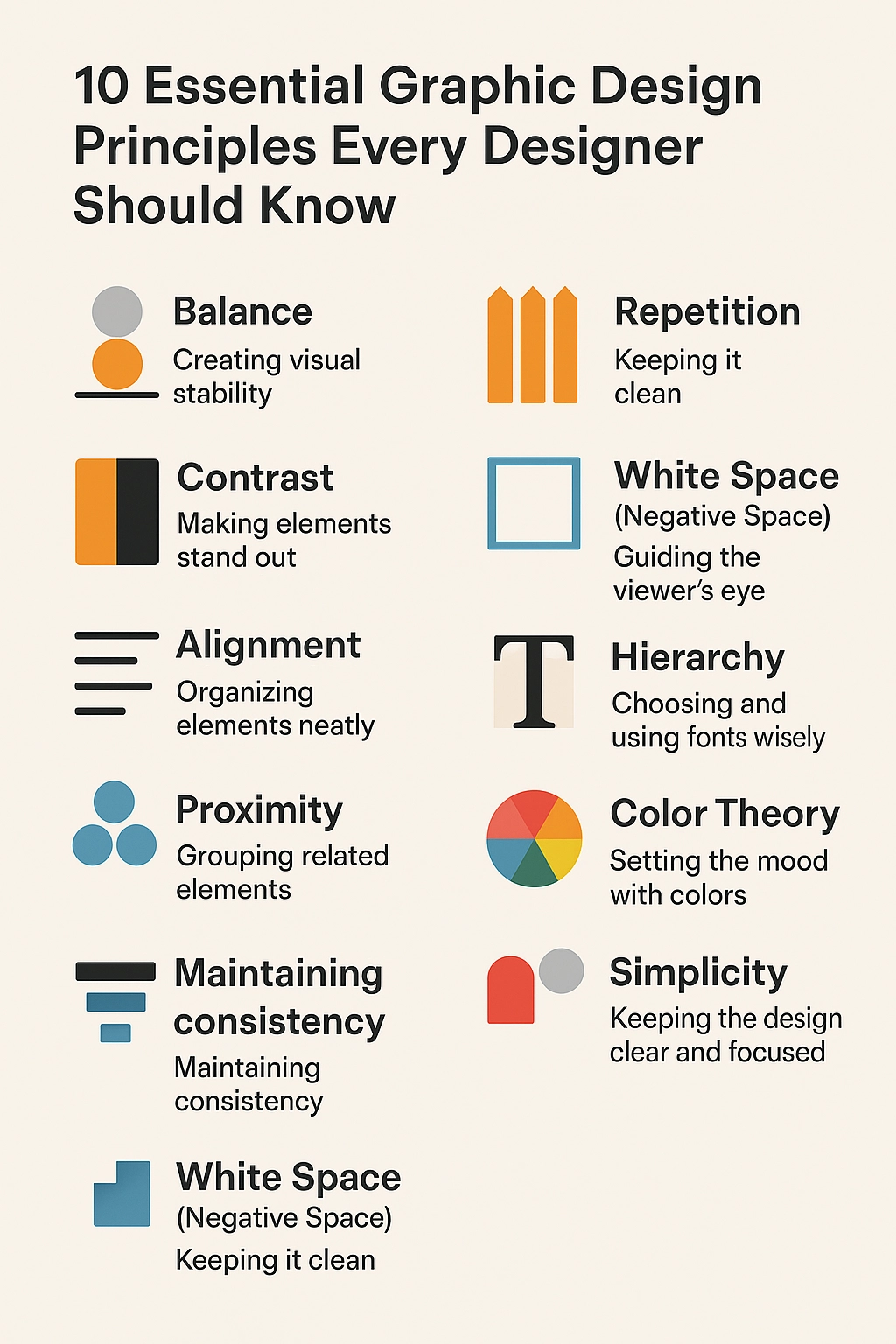
Graphic Design Principles
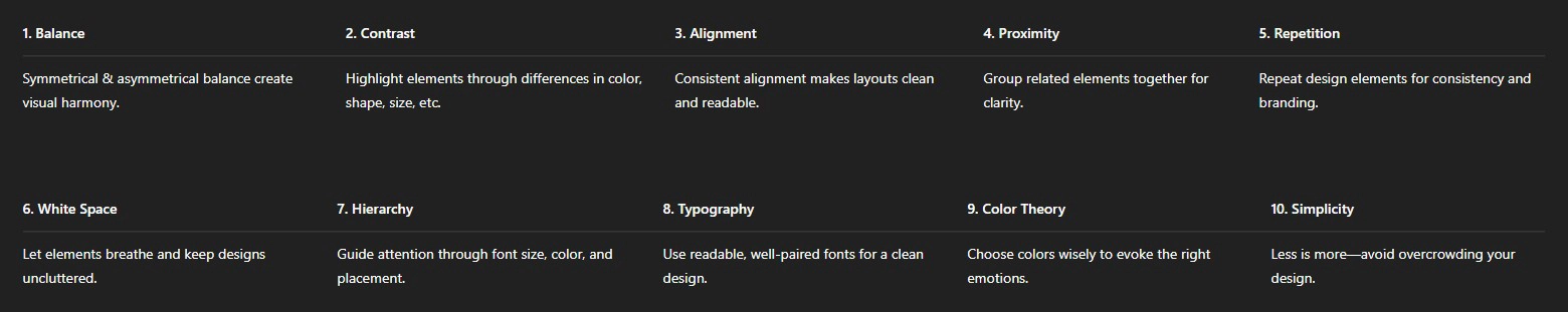
1. Balance – Creating Visual Stability
Balance ensures that no part of the design feels heavier than another, maintaining visual stability. There are two main types of balance:
-
Symmetrical Balance – Elements are evenly distributed, creating a harmonious and formal look. Example: A business card with text centered on both sides.
-
Asymmetrical Balance – Different elements are placed strategically to create a dynamic look while maintaining equilibrium. Example: A modern website with an image on one side and text on the other.
💡 Tip: Use a grid system to maintain balance in layouts.
2. Contrast – Making Elements Stand Out
Contrast helps differentiate elements and makes important aspects stand out. Without contrast, designs look flat and uninteresting.
You can create contrast using:
-
Color: Light vs. dark (e.g., white text on a black background).
-
Shape: Circles next to squares for a striking difference.
-
Size: Large headings with smaller body text to create visual hierarchy.
💡 Tip: Use high contrast for readability—especially in typography.
3. Alignment – Organizing Elements Neatly
Alignment ensures that all elements in a design have a structured relationship. It makes the design cleaner and easier to read.
-
Left, right, or center alignment ensures text and visuals are placed consistently.
-
Grid-based alignment (like in website or magazine layouts) helps organize elements in a structured way.
💡 Tip: Avoid using too many different alignments in one design—it can make it look chaotic.
4. Proximity – Grouping Related Elements
Proximity refers to how closely related elements are positioned. It helps create a sense of organization and clarity.
Examples:
✅ A headline placed near a paragraph to indicate they belong together.
✅ Icons and text descriptions grouped together for better readability.
💡 Tip: Increase spacing between unrelated elements to avoid confusion.
5. Repetition – Maintaining Consistency
Repetition helps strengthen brand identity and visual consistency.
Elements that should be repeated:
-
Colors (use the same color palette across all branding materials).
-
Fonts (stick to 2–3 complementary fonts throughout your designs).
-
Layouts (use a consistent grid structure in multiple designs).
💡 Tip: Repetition builds recognition—think about famous brands like Coca-Cola’s red and white or Apple’s minimalistic aesthetic.
6. White Space (Negative Space) – Keeping it Clean
White space, also known as negative space, refers to the empty areas around design elements. It prevents clutter and makes the design feel modern and easy to read.
Examples:
✅ Apple’s clean and minimalistic product pages.
✅ Simple, spacious magazine layouts that make content easier to read.
💡 Tip: Don’t be afraid of empty space—“less is more” in modern design!
7. Hierarchy – Guiding the Viewer’s Eye
Hierarchy ensures that viewers focus on the most important elements first. You can create visual hierarchy using:
-
Size: Headlines should be larger than body text.
-
Color: Bright colors attract attention first.
-
Placement: The most important elements should be positioned where the eye naturally lands (e.g., the top center of a poster).
💡 Tip: Think of newspaper layouts—headlines are big and bold, subheadings are smaller, and body text is smallest.
8. Typography – Choosing and Using Fonts Wisely
Typography plays a crucial role in making designs legible, aesthetic, and professional. Key typography principles:
✅ Font Pairing: Use contrasting fonts (e.g., a serif for headlines and a sans-serif for body text).
✅ Readability: Avoid overly decorative fonts in body text.
✅ Hierarchy in Fonts: Use bold, italic, or different sizes to emphasize important information.
💡 Tip: Stick to 2–3 fonts maximum per design for a professional look.
9. Color Theory – Setting the Mood with Colors
Colors evoke emotions and influence perception. Choosing the right color combinations is essential for an effective design.
Common color schemes:
-
Complementary Colors (opposites on the color wheel, e.g., blue & orange) create a bold look.
-
Analogous Colors (next to each other on the wheel, e.g., blue, teal, and green) create a harmonious feel.
-
Monochromatic Colors (different shades of one color) create a sophisticated, minimalist look.
💡 Tip: Use color psychology—red conveys passion/urgency, blue trust/calmness, and green growth/sustainability.
10. Simplicity – Keeping the Design Clear and Focused
A cluttered design confuses the audience, while a simple design delivers the message clearly.
-
Remove unnecessary elements.
-
Focus on the key message.
-
Keep text short and to the point.
💡 Tip: Follow the “KISS” rule—”Keep It Simple, Stupid!”
Design Principles
Conclusion
Mastering these 10 essential graphic design principles will help you create professional, visually appealing, and effective designs. Whether you’re working on branding, social media graphics, motion graphics, or web design, applying these principles will improve your work significantly.
💬 Which principle do you find most useful? Let me know in the comments! 🚀

Recent Comments